Having a good website is essential for any business in the digital age. A website is your online storefront, your brand identity, and your first impression on potential customers. But you can’t appreciate the good until you have seen the bad. So, let’s have a look at a couple of companies with bad websites.
However, not all websites are created equal. Some websites are so poorly designed that they drive away visitors, damage the company’s reputation, and hurt its bottom line. In this article, we will look at 10 examples of companies with bad websites and what makes them bad. We will also give some tips on how to avoid these mistakes and create a better website for your business.
1. Ling’s Cars
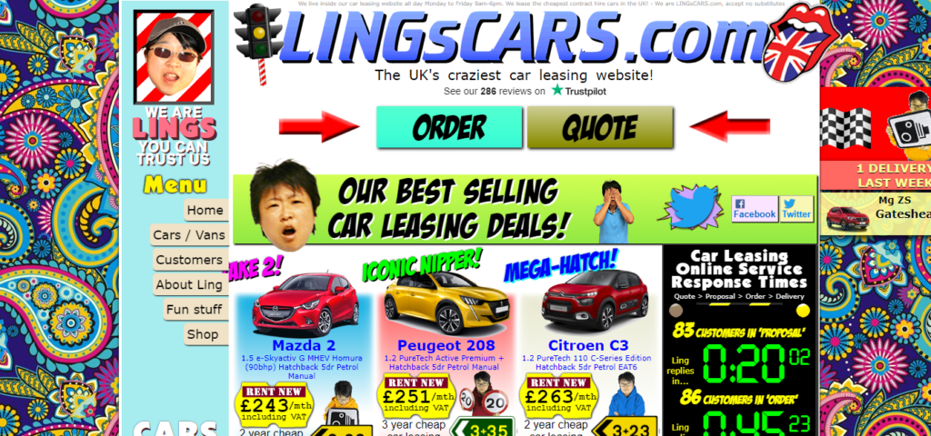
Ling’s Cars is a UK-based car leasing company that claims to be the “UK’s craziest car leasing website.” However, crazy is not always good when it comes to web design services. Ling’s Cars website is a chaotic mess of bright colors, flashing GIFs, loud music, and random information. The website looks like a parody of a bad website, but it is real.
The website is so cluttered and distracting that it is hard to find what you are looking for. The navigation menu is hidden behind a button that says “menu,” which is easy to miss among the other elements on the page. The website also has a lot of irrelevant content, such as Ling’s blog, videos of her singing karaoke, and a live chat feature that pops up randomly.
The website fails to communicate the value proposition of the company and does not inspire trust or confidence in the visitors. The website also has a lot of accessibility issues, such as low contrast, small fonts, and lack of alt text for images.
2. Arngren
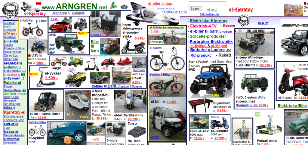
Arngren is a Norwegian online store that sells various products, such as electronics, gadgets, toys, and clothing. However, the website looks like it was designed in the 90s and has not been updated since then. The website has a very unprofessional and amateurish appearance, with low-quality images, pixelated fonts, and inconsistent layout.
The website is also very confusing and hard to navigate. The homepage has no clear hierarchy or structure and displays hundreds of products randomly. The products are not categorized or filtered and have no descriptions or prices. The website also has a lot of broken links and errors.
The website does not provide any information about the company, its policies, or its contact details. The website also has no security features or trust badges to assure the visitors that their transactions are safe and secure.
3. Yahoo
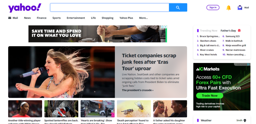
Yahoo is one of the oldest and most popular web portals. However, the website has not aged well and has lost its relevance and appeal over the years. The website suffers from information overload and a lack of focus. The homepage tries to cover too many topics and features simultaneously, such as news, sports, entertainment, finance, mail, search, weather, horoscope, and more.
The website also has a lot of ads and sponsored content that clutter the page and interfere with the user experience. The website does not have a clear identity or purpose and does not offer any unique value to the visitors. The website also has a dated and dull design that does not reflect the current trends and web design standards.
4. Yale School of Art
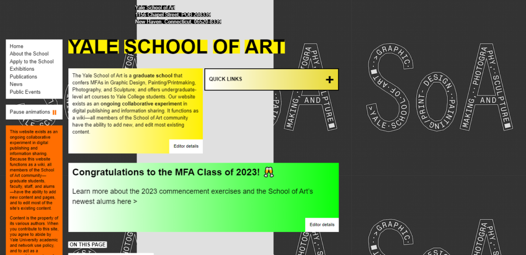
Yale School of Art is one of the most prestigious art schools in the world. However, the website does not reflect the quality and reputation of the institution. The website has a bizarre and experimental design that makes it hard to use and understand. The website uses a lot of unconventional elements, such as random shapes, colors, animations, fonts, and layouts.
The website also has a lot of usability issues, such as poor navigation, broken links, missing images, and slow loading time. The website does not provide clear information about the school, its programs, its faculty, or its admissions process. The website also does not showcase the students’ work or achievements.
The website seems more focused on being artistic than being functional or informative. However, art should not come at the expense of user experience or communication.
5. Simcast
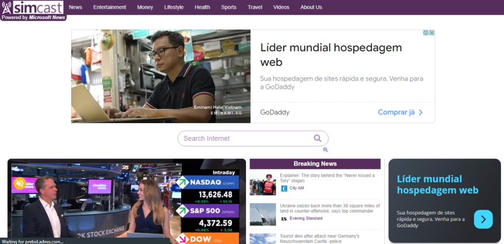
Simcast is a company that provides live-streaming services for sports, entertainment, and news.
However, their website looks like it was made in the 90s, with outdated graphics, fonts, and colors. The layout is cluttered and confusing, with too many links and buttons competing for attention.
The navigation is poor, with no clear hierarchy or categories. The content is vague and uninformative, with no clear value proposition or call to action.
The website does not inspire trust or confidence in the quality of its services. Simcast is an example of a bad website that needs a major overhaul.
6. The Useless Web
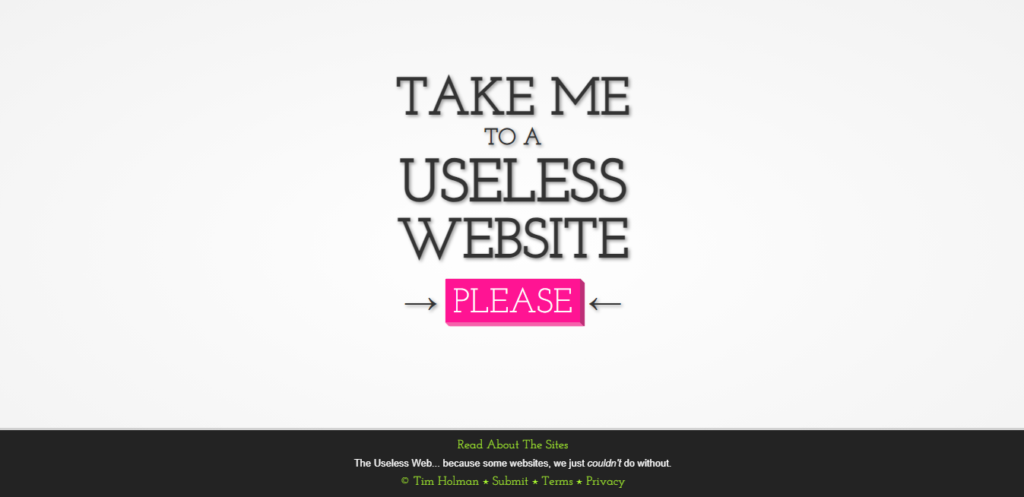
The Useless Web is a website that takes you to a random useless website every time you click on the “please” button. The website claims to be “the most pointless website ever,” and it is hard to argue. The website has no purpose or value other than wasting time and bandwidth.
Some of the useless websites that you might encounter include Endless Horse, which is a website that shows an infinitely long horse; Cat Bounce, which is a website that shows bouncing cats; and The Pigeon, which is a website that shows a pigeon and nothing else. The website has no design or functionality other than the button and the logo.
The website might be amusing for a few minutes, but it quickly gets boring and repetitive. The website also has no information about who created it or why.
7. Berkshire Hathaway Inc.
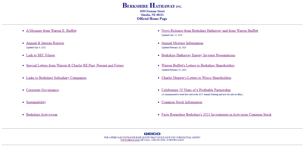
Berkshire Hathaway Inc. is one of the largest and most successful conglomerates in the world, led by the legendary investor Warren Buffett. However, the website does not reflect the company’s status or achievements. The website has a simple and plain design, with a white background, blue text, and no images or graphics.
The website looks like it was made in the early days of the Internet and has not been updated since then. The website has no branding or identity and does not showcase the company’s products, services, or values. The website also does not have any interactive features or social media links.
The website might be intentionally minimalist and modest to reflect Buffett’s philosophy and personality. However, the website does not communicate the company’s vision or mission or engage or inform the visitors.
8. IMDb
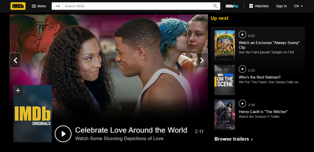
IMDb is one of the most popular and authoritative sources of information about movies, TV shows, celebrities, and entertainment news. However, the website has a lot of room for improvement regarding web design. The website has a cluttered and outdated design, with many ads, banners, pop-ups, and widgets.
The website also has a lot of content and features that are not well organized or categorized. The website does not have a clear hierarchy or structure which makes it hard to find what you are looking for. The website also has a lot of usability issues, such as slow loading time, broken links, and inconsistent layout.
The website could benefit from a more modern and sleek design that enhances the user experience and showcases the content better. The website could also use more personalization and customization options for the visitors.
9. MIT Center For Advanced Visual Studies Special Collection

MIT Center For Advanced Visual Studies Special Collection is a website that archives and displays artists’ work affiliated with the MIT Center for Advanced Visual Studies (CAVS) from 1967 to 1998. The CAVS was a pioneering research center that explored the intersection of art, science, technology, and the environment. However, the website does not do justice to the legacy and innovation of the CAVS.
The website has a very poor and confusing design that makes it hard to use and understand. The website uses a lot of unconventional elements, such as random shapes, colors, animations, fonts, and layouts. The website also has a lot of usability issues, such as poor navigation, missing images, and slow loading time.
The website does not provide any clear information about the CAVS, its history, its goals, or its impact. The website also does not showcase the artists’ work in an appealing or accessible way.
10. Lipton
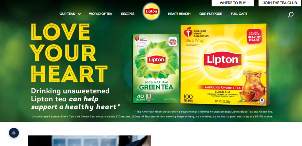
Lipton is one of the most well-known and popular tea brands in the world. However, the website does not reflect the quality and variety of the products. The website is bland, with a beige background, brown text, and no images or graphics.
The website has no branding or identity and does not showcase the benefits or features of the tea. The website also does not have any interactive features or social media links. The website does not provide any information about the company, its history, its values, or its sustainability efforts.
The website could benefit from a more colorful and vibrant design that matches the personality and diversity of the tea. The website could also use more content and features that engage and inform the visitors, such as recipes, stories, quizzes, or videos.
I hope you enjoyed reading this article and learned something new. If you want to create a better website for your business, you can use some of these tips:
- Use a clear and consistent layout and structure
- Use high-quality images and graphics
- Use contrast and hierarchy to highlight important elements
- Use clear and concise content that communicates your value proposition
- Use interactive features and social media links to engage your visitors
- Use user testing tools to evaluate and improve your website
Thank you for your time and attention. Have a great day!
