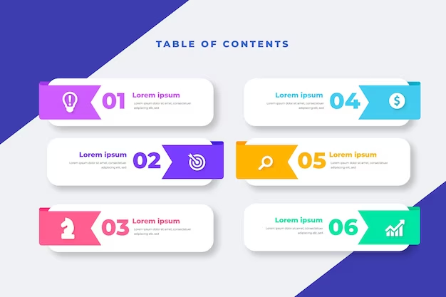
A magazine table of contents is more than just a list of articles and page numbers. It’s an opportunity to showcase your magazine’s style, personality, and value. It’s also a way to entice your readers to explore your magazine and discover the content that interests them.
But how do you design a magazine table of contents that stands out from the crowd? How do you make it creative, attractive, and functional? Here are seven magazine table of contents designs to inspire you. Each of these designs has its own features and advantages, and you can use them to create your own magazine table of contents.
1. Use Colors

One of the simplest and most effective ways to design a magazine table of contents is to use colors. Colors can help you create contrast, hierarchy, and harmony in your layout. They can also help you convey your magazine’s mood, tone, and theme.
For example, take a look at this magazine table of contents design from Jeopardy Magazine. It uses a clean, type-centric layout with a color accent. The color accent helps to highlight the magazine’s name, the issue number, and the main article titles. It also creates a sophisticated and elegant look for the magazine.
2. Use Different Fonts and Sizes

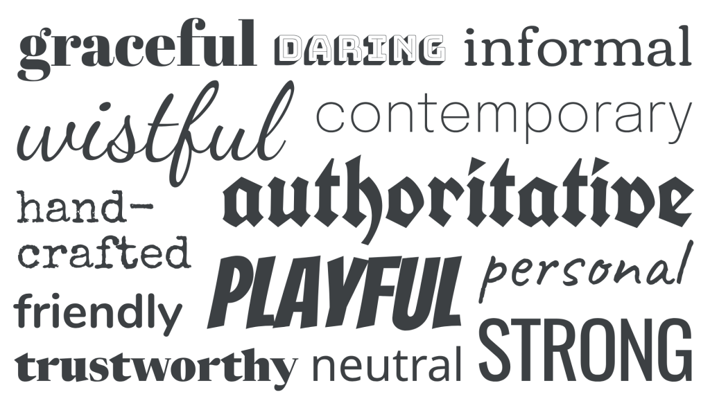
Another way to design a magazine table of contents is to use different fonts and sizes. Fonts and sizes can help you create variety, emphasis, and balance in your layout. They can also help you express your magazine’s personality, voice, and style.
For example, take a look at this magazine table of contents design from Wired Magazine. It uses a combination of big and small letters and numbers to create a dynamic and eye-catching layout. The big letters and numbers help to draw attention to the main article titles and the page numbers. The small letters and numbers help to provide additional information and details.
3. Use Images as Content Previews
A third way to design a magazine table of contents is to use images as content previews. Images can help you create visual interest, appeal, and connection in your layout. They can also help you showcase your magazine’s quality, value, and content.
For example, take a look at this magazine table of contents design from Vogue Magazine. It uses images of the featured celebrities and models to create a stunning and glamorous layout. The images help to attract the readers’ attention and curiosity. They also help to highlight the magazine’s exclusivity, authority, and relevance.
4. Align Contents in a Non-Traditional Way
A fourth way to design a magazine table of contents is to align contents in a non-traditional way. Alignment can help you create order, structure, and alignment in your layout. It can also help you create contrast, movement, and interest in your layout.
For example, take a look at this magazine table of contents design from Kinfolk Magazine. It uses a diagonal alignment of the article titles and the page numbers to create a unique and creative layout. The diagonal alignment helps to break the monotony and boredom of the traditional horizontal or vertical alignment. It also helps to create a sense of flow and direction for the readers.
5. Use Icons and Symbols

A fifth way to design a magazine table of contents is to use icons and symbols. Icons and symbols can help you create simplicity, clarity, and recognition in your layout. They can also help you communicate your magazine’s message, theme, and content.
For example, take a look at this magazine table of contents design from National Geographic Magazine. It uses icons of animals, plants, and places to create a simple and clear layout. The icons help to represent the topics and categories of the articles. They also help to convey the magazine’s mission, vision, and values.
6. Use Shapes and Patterns
A sixth way to design a magazine table of contents is to use shapes and patterns. Shapes and patterns can help you create unity, diversity, and harmony in your layout. They can also help you create contrast, rhythm, and balance in your layout.
For example, take a look at this magazine table of contents design from Elle Magazine. It uses shapes and patterns of circles, squares, and lines to create a modern and stylish layout. The shapes and patterns help to frame and organize the article titles and the page numbers. They also help to create a sense of movement and energy for the readers.
7. Use White Space
A seventh way to design a magazine table of contents is to use white space. White space is the empty space between and around the elements of your layout. It can help you create focus, hierarchy, and readability in your layout. It can also help you create a sense of elegance, sophistication, and professionalism in your layout.
For example, take a look at this magazine table of contents design from Monocle Magazine. It uses a generous amount of white space to create a minimalist and elegant layout. The white space helps to highlight the magazine’s name, the issue number, and the main article titles. It also helps to create a sense of calmness and clarity for the readers.
Final Analysis
A magazine table of contents is an important part of your magazine design. It can help you showcase your magazine’s style, personality, and value. It can also help you entice your readers to explore your magazine and discover the content that interests them.
But to have a great magazine table of contents, you also need a great website. A website is the first impression that your audience will have of your magazine. It’s also the main platform where you will publish and distribute your magazine content.
Looking to enhance your online presence and captivate your audience with a stunning website? Our expert web design services are tailored to your unique needs. Contact us today to elevate your brand and leave a lasting impression on the digital landscape. Your success is just a click away!

